
Brand Guidelines
Identity, Voice, Visual System & Application
Philosophy
Opt-Out Social
You start full, not empty. Every other app makes you build from scratch. Also starts you with people you already have something in common with.
No Adding, Just Meeting
You don't add people here. You meet them. Then decide.
Groups Come First
They're the reason you have people in common. The social container for everything.
Default is Inclusion
Removing is the action, not adding. No friend requests. No follow buttons.
Logo System

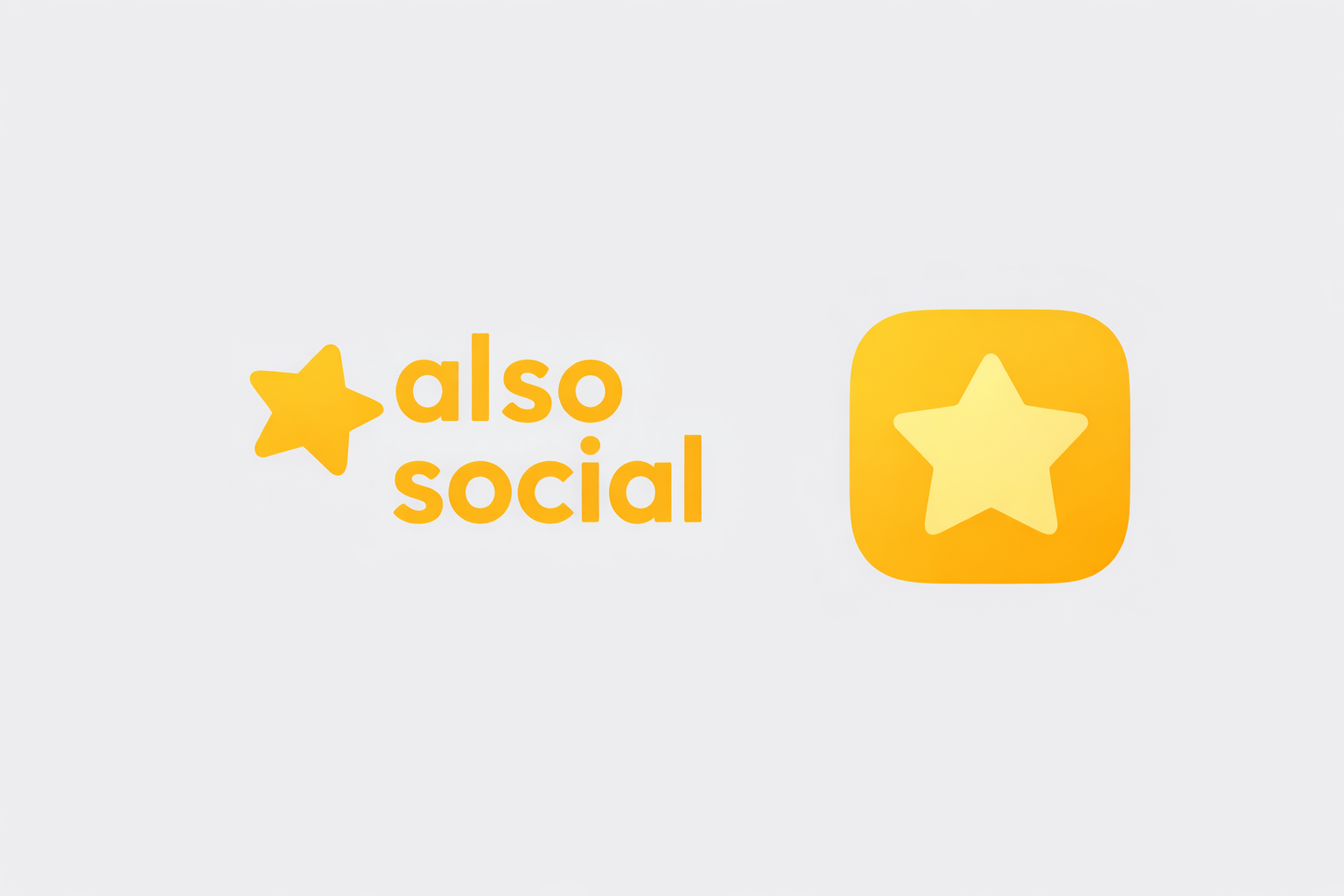
Logo Usage Rules
Do
- Maintain 1x symbol height as clear space on all sides
- Use on white, dark (#14120C), or gold (#FEEE86) backgrounds
- Keep proportions locked (no stretching)
- Minimum size: 24px height (digital), 10mm (print)
Don't
- Place on busy or low-contrast backgrounds
- Rotate, skew, or apply effects/shadows
- Change logo colors (only approved lockups)
- Crop or partially obscure the logo
- Place text closer than clear space allows
Color Palette — Light Theme
Color Palette — Dark Theme
Contrast Rules (Mandatory)
Gold backgrounds always require dark text (#252422 or #1D1C07). No exceptions.
Typography
Quicksand
The quick brown fox jumps over the lazy dog
The quick brown fox jumps over the lazy dog
The quick brown fox jumps over the lazy dog
The quick brown fox jumps over the lazy dog
The quick brown fox jumps over the lazy dog
Heading 1 — 54px Bold
Heading 2 — 38px SemiBold
Heading 3 — 27px SemiBold
Body — 16px Regular
Caption — 13px Medium
Iconography — Solar Icons
All icons use Solar Icons exclusively. Linear for inactive states, Bold for active.
Size: 24px standard | 20px compact | 28px+ hero
Color: #252422 on light surfaces | #E6E1D6 on dark surfaces
Never mix with Material Icons, Cupertino Icons, or FontAwesome
Shape System — Squircle
radius: 12px
radius: 16px
radius: 24px
full circle
Squircle = Groups, Cards, Buttons
Every non-person element uses rounded rectangles
Circle = People Only
Avatars and person indicators exclusively
Never use sharp corners
No sharp rectangles anywhere in the system
Voice & Tone
We are
- Dry, not snarky
- Warm, not gushing
- Calm & confident
- Plain & direct
- Human, short sentences
Banned Words
connectnetworkendorsefollowersfeedbotengage
Also Words
- meet
- introduce / intro
- Inner Circle
- Theatre
- group
- show up
Social Media Profiles
Profile Picture / Avatar
- Shape: Square (platforms auto-crop to circle)
- Background: #14120C (dark) or #FFFFFF (light)
- Logo: Centered symbol with 20% padding
- Min size: 400x400px for clarity at all sizes
Cover / Header Image
- Ratio: 3:1 (1500x500 for Twitter/X, LinkedIn)
- Style: Subtle brand gold gradient or photography
- Text: Minimal — tagline only if needed
- Safe zone: Keep critical content in center 60%
Social Media Posts
Post Template Specs
| Instagram Feed | 1080 x 1080px |
| Instagram Story | 1080 x 1920px |
| LinkedIn Post | 1200 x 627px |
| Twitter/X Post | 1200 x 675px |
| Facebook Post | 1200 x 630px |
Post Design Rules
- Use Quicksand font exclusively
- Dark text on gold backgrounds (never white on gold)
- Squircle frames for any contained imagery
- Logo symbol watermark: bottom-right, 8% of image width
- Color palette: only use approved brand colors
- Photography: real people, real situations, never stock
Inspiration Reference: Qoves
Study the feeling of a premium membership, then make it ours.
What to borrow
- Membership feels like access to a considered system, not a content pile.
- Every touchpoint signals progress, taste, and a clear reason to return.
- Education is packaged with restraint: strong visuals, useful detail, no shouting.
Translate for Also Social
- Membership: a group is a trusted room with people you already have something in common with.
- Value: useful context, warm intros, and a visible Inner Circle from day one.
- Return: show up for the next person, intro, Theatre moment, or group ritual.
The promise: joining Also Social should feel like getting a key, not filling out another profile.
Aesthetic Social Video Strategy
Make the feeling visible before explaining the product.
Real-world fragments
Hands passing a phone, a door opening, a group arriving, two people recognizing a shared group.
Product as object
Slow screen movement, tactile crops, gold light, deliberate transitions. Let the interface carry the story.
One thought per cut
Six to twelve seconds. One line of text at most. End on a human beat, not a feature list.
Car Profiling & Vehicle Branding
Placement Rules
- Door panels: Wordmark, centered, min 300mm wide
- Rear: Symbol only, min 80mm diameter
- Hood: Not recommended (distortion when viewed at angle)
- Color: White or gold wordmark on dark vehicles; dark (#252422) on light vehicles
- Material: Matte vinyl only — no gloss over matte paint
- Clear space: 2x symbol height on all sides minimum
Anti-Features (Never Build These)
Upvotes / Downvotes
Gamifies social validation. Creates popularity contests.
Emoji Reactions
Shallow engagement. Reduces people to counts.
Like Counts
Public scoring of people and content.
Follower Counts
Collecting people, not meeting them.
Engagement actions must require human intent. One-tap reactions are not engagement.
Design Language — Liquid Glass
Surfaces feel like light passing through translucent, refractive material
- Surfaces have physical presence — they exist in space
- Layered translucency (purposeful, not full glassmorphism)
- Soft, diffused highlights suggesting curvature
- Smooth transitions — fluid, not rigid
- Gold accents glow from within, not painted on
- Depth through layering, not hard borders
Readability always wins over visual effect.
Quick Reference
Font
Quicksand
400 / 500 / 600 / 700
Primary Gold
#FEEE86 (light)
#F2E27C (dark)
Deep Gold
#FEBA1B (light)
#F0B029 (dark)
Shapes
Squircle: 16px radius
Circle: people only
Icons
Solar Icons only
Linear + Bold pair
City
Sola, Norway
(never Oslo)
Social infrastructure for real relationships.
"If people leave the app because they are busy living their lives — we have succeeded."
Sola, Norway · 2025–2026